The Apple logo is one of the most recognizable company symbols ever. You probably see it several times each day: at work, on the train, on TV, and in the mall. But the iconic logo wasn’t always so streamlined and recognizable. In fact, the evolution of the Apple logo is just as interesting and innovative as the products the company makes. Here’s a timeline of how the logo came to be.
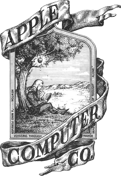
1976: With the creation of the Apple Computer Company came the necessity for the first logo. It was nothing like the iconic fruit shape you know and love today. Instead, it was a complicated sketched picture of Sir Isaac Newton, designed by Apple co-founder Ronald Wayne. Penned around the outside of the picture was the unlikely motto, “A mind forever voyaging through strange seas of thought … alone.”
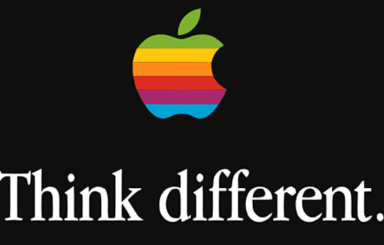
1977: That logo and motto didn’t last long. Steve Jobs himself banished the old logo only one year into the company’s existence. Instead, he asked designer Rob Janoff for his ideas. Janoff came up with the perfect tag line—”Byte into an Apple”—with an image of a bitten apple. His design was rainbow-colored, which he later admitted was only because the all-red design looked like a cherry tomato.
1998: The rainbow incarnation of the Apple logo lasted a whopping 21 years. It wasn’t until Steve Jobs came back to Apple that he ordered a complete overhaul of the brand’s image, going from bright bulbous computers to sleek new silver models. The new logo had to be equally sleek, which is why it went from rainbow to solid black.
2011: After the black version of the Apple logo rolled out, Apple hasn’t been shy about playing around with the color and the dimension of the iconic apple. By 2011, it went from solid black to a number of different colors and most noticeably, a 3D silver incarnation to match the almost white glowing apple found on the back of Apple laptops. Of course, the black logo is still in circulation, most noticeably on the iPhone 5c.
The evolution of the Apple logo isn’t just an important bit of history, but a commentary on design and trends throughout the last 35 years. From bright and eye-catching to sleek and streamlined, Apple has always been ahead of the curve, even when it comes to something as simple as a logo.
Is the Apple logo one of your favorites? What are some others?
Image courtesy of Wikimedia Commons.
[cf]skyword_tracking_tag[/cf]


