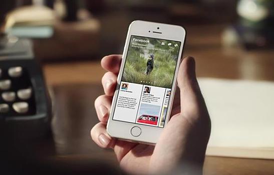
Facebook is launching Paper, a news app that curates a person’s interests, reports TechCrunch. The app will enable users to view the photos, posts, and videos in their News Feed in a variety of designs. Users can customize the app and change its themes to suit their own style, with selections ranging from science and design to photography and sports.
What Users Can Get on Paper
Paper’s intuitive features set it apart from other competing news apps by allowing users to pick stories with simple, natural movements. Almost everything responds to touch and motion: Tilting the phone provides an up-close look at high-resolution panoramic photos, while full-screen video auto-play immediately draws users into whatever they are watching.
The reading experience has also been reimagined. Stories will have detailed covers that make it easy to spot content from trusted sources and publishers. Users can click on article posts to make them unfold and appear in full-screen for a more focused view.
True to the Facebook ethos, sharing will be easy on the app. Any post, photo, or video shared will appear exactly as it’s displayed on the live app preview. Users can also add “sections” to the app to filter different kinds of content such as sports, headlines, entertainment, business, or food, among many others.
The Inspiration Behind Paper
For many, Paper will appear to be a near exact copy of Flipboard, a content curation app that presents information in a magazine-like fashion. According to TechCrunch, “Paper is the first app out of Facebook Creative Labs, an initiative to let small teams within Facebook build stand-alone mobile experiences as if they were nimble start-ups.”
Facebook is looking to expand in the mobile app market, and having single-purpose experiences divided among multiple apps rather than pushing all functionality into a single app will enable the company to develop and deploy such initiatives more quickly.
Announced last week, Paper is launching on iOS on February 3. Once users download and open the Paper news app, they will first see the reimagined News Feed interface, with big photos and videos filling the top half of the screen, while the bottom half will feature the user’s status updates and other posts. Tapping or swiping prompts an unfolding animation to display the next content item. Pinching an article folds it back and returns the user to the News Feed. Facebook has released this video that shows examples of how Paper will operate.
Will you be downloading the Paper app once it is released?
Image courtesy of Facebook
[cf]skyword_tracking_tag[/cf]

